

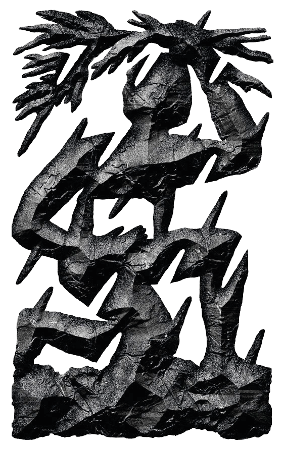
Emblem,
Archipolis Architectes –
All rights reserved.
Design by :
Les Formes Associées
Case study
Archipolis’ partners called upon Njim services to shape their brand platform. given the specific context of the company’s takeover by two former colleagues, there was an interesting opportunity in terms of assessing the existing situation and identifying obstacles to the positioning sought after.
the relevance of intended positioning being directly linked to the quality of the architectural execution, it was essential to examine the operational processes and identify the necessary levers for a smooth running of projects and a compliant execution of designs.
Njim therefore focused its support on operational levers of brand strategy— processes’ standardization, work organization, design and standardization of commonly used communication tools, harmonization of the brand message, to name a few.
In terms of visual translation, after assessing and inventorying the needs of the partners, the design of the firm’s identity was entrusted to Alexandra Rio and Héloïse Derly from ‘Les Formes Associées’ design studio. This results in visual elements skillfully executed and reflecting the partners’ influences, such as their emblem, which blends rusticity, primitivism and sensitivity.
Discover ARCHIPOLIS Architectes’ work below:
archipolis.fr
FIELDS
Branding project management
Communications & marketing
Management & organization